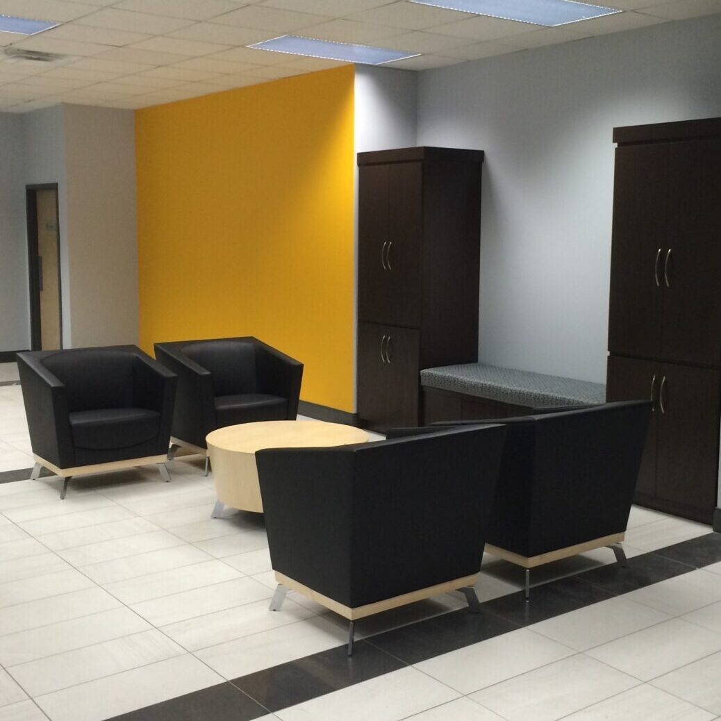
Office
By: JoAnn K. Collins, President/ Licensed Interior Designer
Montage’ Interiors, Inc.
As a successful interior designer and color expert, I often get asked about the best ways to use color in a space. First, color is personal and depending on your vision, training and experience, people can view colors differently. Second, color can change your mood and how you feel in a room which is the psychology aspect of color. Finally, color when used skillfully can highlight architectural details, define spaces, and even refresh a space! Color can be a best friend or the worst nightmare. Most of us have experienced finding that perfect something…whether for the home or our wardrobe and then hoping it is available in a different color!
The pandemic has changed the way most of us live, work, and play, and the environments that surround these activities including the current paint and decorating trends. The time spent quarantining has given us the opportunity to access our current space plans, the furniture we are using to support a multitude of tasks including meals, homework, and workspace, as well as the colors in and around the rooms that we are living. This has no doubt increased the design community’s warning to stay away from gray because when used in the wrong environment or in the wrong shade it can feel depressing!
For the past twenty-four months, we have seen a subtle shift away from gray. While many of us have tried to steer our client’s color schemes in a new direction there is still something appealing about the use of gray. Ironically, the Pantone Color of the Year for 2021, is two colors: “Ultimate Gray” which is a medium tone gray together with “Illuminating,” an uplifting yellow. For decades now, gray has been the most popular neutral. However, “gray” or “grey” does not have to become the latest four-letter word. It can still be a viable option providing a blank slate or backdrop for adding more colorful personal touches in artwork, pillows, and accessories inside a space or on the exterior of a building to blend or contrast against masonry, roofing, and landscape materials. Gray can still be a great long-term neutral option for commercial spaces especially for systems furniture paint, as well as, when mixed with other surfaces and materials.
The use of color and especially gray can also be impacted by the area of the country where you live. Here, in Northwest Indiana, outside of Chicago, we experience the four seasons. Lately, the cold and overcast skies of winter seem to dominate. Therefore, we tend to embrace the warmth in the colors of spring and summer and extend them into our indoor and outdoor spaces. We cannot wait to break away from the grays of winter to find the sun! In the Southwest, it is just the opposite. Many people crave cooler colors to create a sense of cool against the desert heat. The interiors can trend towards cooler accents and more muddied neutrals. Look at our two project examples which illustrate the use of gray furniture contrasted by personal accents and additional colors in the Midwest and Southwest-two very different uses of the color gray, and both still on trend.
The secret is the 60/30/10 Color Rule: 60% is the main color in the space, 30% is the secondary color, and finally 10% is the accent color. Both examples use the 60% in contrasting paint tones as the backdrop to the gray sofa/sectional. The gray is represented as the neutral in the primary upholstered pieces. Finally, the color punch is found in the 10% accents. While the percentages may not be exact, you get the gist of the formula. You might think of the formula with respect to an inverted triangle with the overall color at the widest part, a secondary color just below the middle of the triangle, and the third color near the point.
Remember color trends are cyclical. If you live long enough, you may even notice a nod to a similar color you remember being popular in a previous decade. This is because there are no bad colors…just colors being used badly! With the right balance, shade, and hue you can create the right color scheme for your next project even using g-r-a-y-!

